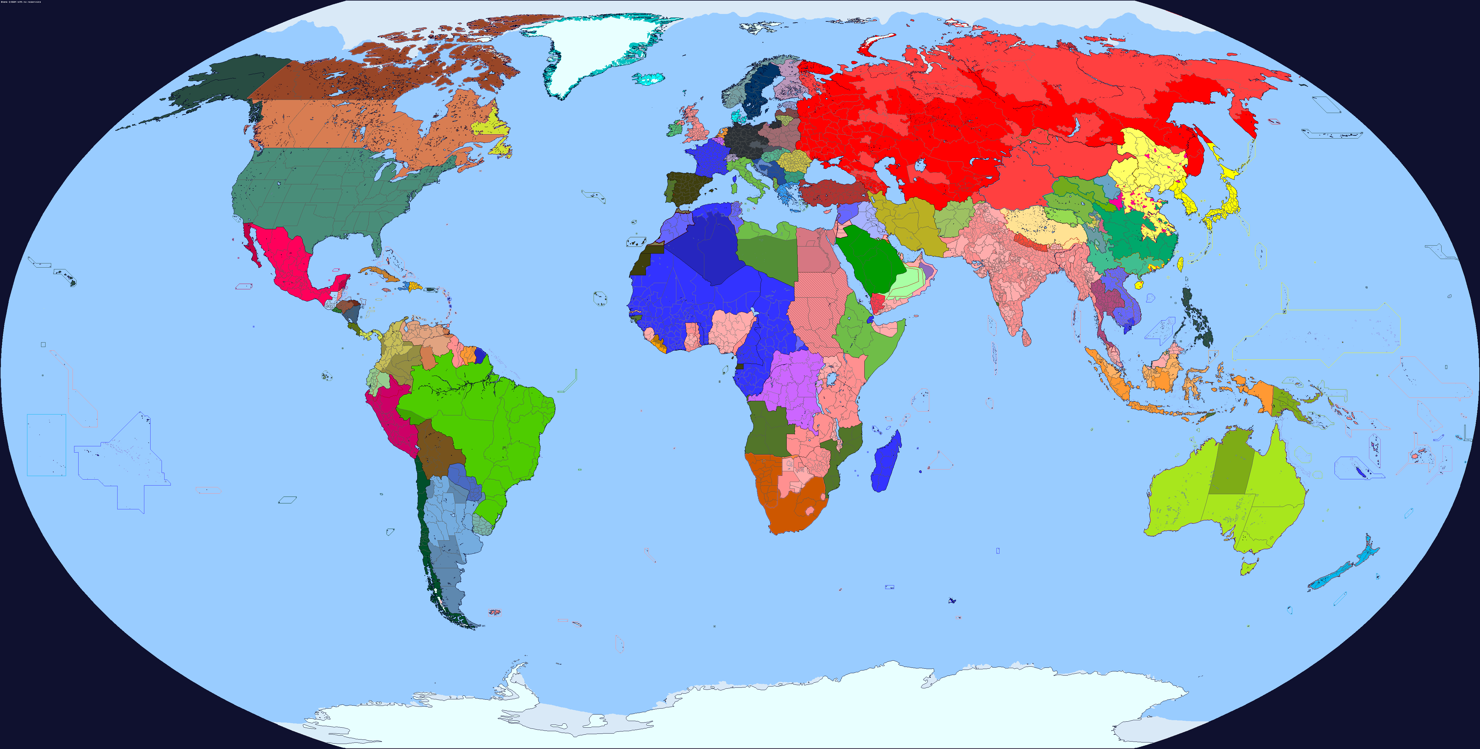
All the more reason not to be a communisti really hate to be That Person but the USSR is so garishly red it hurts to look at
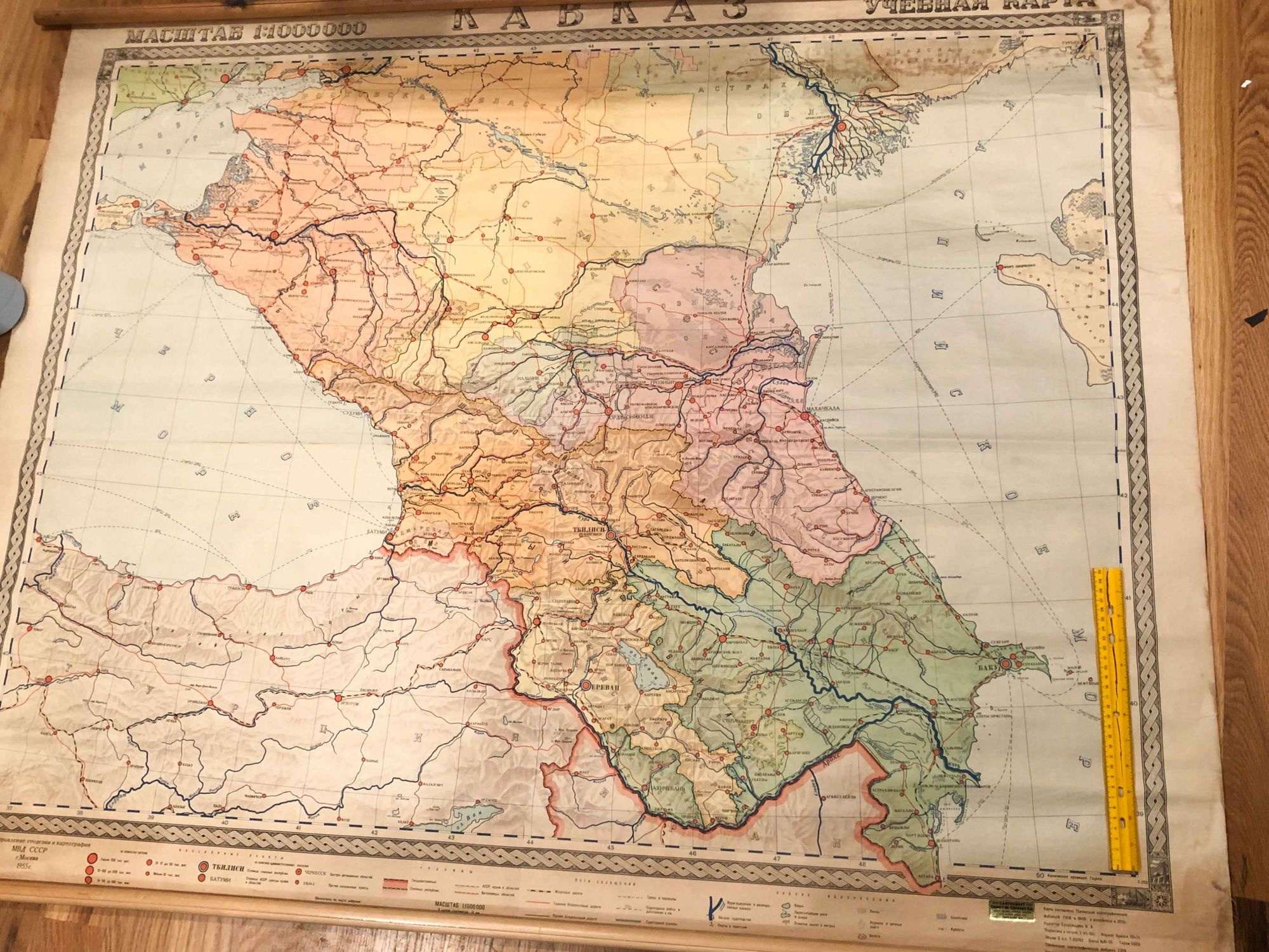
The caucasus is weird. If that map is correct, that's an extremely useful resource. The issue with Caucasus subdivisions during the USSR is that the ones in the modern day were all made by their 1991 constitutions, and apparently their origins weren't in the USSR, unlike most of the other soviet republics. Is there a source you know of that can verify that these subdivisions existed? (And I mean the ones beside Nagorno-Karabakh and the Kurdistan Uyezd)I would like to suggest one small correction about the Nagorno-Karabakh Autonomous Oblast and the Red Kurdistan region according to this map:
View attachment 882786